

Brand and interface
The name, logo, colours, fonts and form components every screen is built from.
Every screen of the kit is built from the same few things: a name, two image files, eight colour tokens, one font stack, a set of design components and a set of form components. Change them once and the whole interface follows, admin panel and emails included. This guide says where each one lives, what reads it, and which component to reach for when you build a screen of your own.
Name, logo and icon
| What | Where it is set | Default | Where it appears |
|---|---|---|---|
| Name | APP_NAME in .env |
Laravel |
Browser title, image alt texts, the public navigation and footer, the PWA name, emails |
| Logo | logo in config/app.php |
images/logo.svg |
The header of every email, the mobile sidebar drawer of the signed-in area, the header of the help centre |
| Icon | icon in config/app.php |
images/icon.svg |
The favicon, the desktop sidebar and top bar of the signed-in area, every sign-in screen, the default image of a notification, the base for the PWA icons |
Both paths are relative to public/, so the quickest change is to replace the two files and keep the keys. SVG is what ships; any format a browser renders works. The logo is drawn about 36 pixels high and the icon between 36 and 96, so give both a transparent background and enough contrast on white.
A design folder can also bring its own brand, the way it brings its own palette: resources/brand/your-project.php returns logo, icon and favicon (paths under public/), logo_on_dark when its sidebar is dark, and installed_app (folder, theme_color, background_color) for the icons, splash screens and colours of the installed app. It is looked up along the same chain as the design components, and the generic resources/brand/project.php answers with the two keys above, so a product without a file of its own sees no change. Weblabor Base's own, resources/brand/weblabor-base.php, is the example, and no other product reads it.
The public landing shows the name as text, not the logo. Its footer prints a "Developed by Weblabor" block from the design component public-footer. To change it, add your own public-footer.blade.php to your design folder, as "Design components" below explains, and no merge from the base touches it.
The PWA icons
When APP_PWA=true the browser also asks for a set of PNG icons and splash screens. config/laravelpwa.php lists them under public/images/icons/, along with the theme_color and background_color the installed app uses. One command generates every file from a single image:
php artisan pwa:generate-assets
It asks for the source image, defaulting to the path in config/app.php, and for two hex colours for the splash gradient. The source must be square and at least 512 by 512 pixels, in a format the GD library reads, so hand it a PNG rather than the SVG icon. The rest of the manifest is in Web push and the PWA.
Colours
Views never name a Tailwind palette. They use semantic tokens, declared once in resources/css/app.css, inside the @theme inline block. The project runs Tailwind 4, so there is no tailwind.config.js: the CSS files are the configuration.
| Token | Default palette | Role |
|---|---|---|
primary |
teal | Your brand: buttons, links, active states, the progress bar |
accent |
the same as primary |
A second brand colour for the landing, never the colour of an action |
secondary |
gray | Muted controls and secondary buttons |
default |
slate | Text, borders and surfaces of the public pages |
positive |
emerald | Success: verified badges, confirmations |
negative |
red | Errors, destructive actions, validation messages |
warning |
amber | Warnings: the PIN reminder banner, an untranslated guide |
info |
blue | Neutral information |
Every token has the eleven shades from 50 to 950, so bg-primary-600, text-negative-600 or border-warning-400 all exist. primary and accent also have a bare value, --color-primary and --color-accent, used by classes such as bg-primary and text-primary and by the page-load progress bar.
Your palette and your font
primary, accent and the font are your brand, so they follow the same rule as the design components: each project keeps its own, and the generic one is the fallback. app.css does not name their colours; it reads them from --brand-* variables:
resources/css/themes/project.cssholds the generic ones, the teal palette and Inter, andapp.cssalways imports it.resources/css/themes/your-project.css, when it exists, is loaded after it on every page, so whatever it sets wins. It is looked up along the same chain as the design components,design_layersinconfig/app.phpor else your project, so a product built on another one inherits that one's palette until it writes its own.
To rebrand, create your file with the variables you change and rebuild:
:root {
    --brand-primary: var(--color-indigo-700);
    --brand-primary-50:  var(--color-indigo-50);
    --brand-primary-100: var(--color-indigo-100);
    /* ... through 950, and --brand-accent-* when you have a second colour */
    --brand-font: "Your Font", ui-sans-serif, system-ui, sans-serif;
}
npm run build
vite.config.js builds every file in resources/css/themes/ on its own, so a new one needs no other edit. Any Tailwind palette works on the right-hand side, and so does a literal colour such as #0f766e when the brand has no palette. Keep the bare --brand-primary in step with the shade you want buttons to use. A font that is not installed on the reader's device has to be loaded: an @import url(...) of its stylesheet at the top of your file does it. Weblabor Base's own file, themes/weblabor-base.css, is an example of all of it, and no other product loads it.
Do not edit themes/project.css to rebrand: it is the generic look every product merges from the base. The semantic tokens, positive, negative, warning and info, are the same for every product and stay in app.css.
Changing your palette changes the whole interface because nothing else knows it. The WireUI components share the same names, primary, secondary, positive, negative, warning and info, and config/wireui.php sets primary as their default colour, so <x-button positive> and a bg-positive-600 badge draw from the same shades. The admin panel and your own views inherit the change with no edit of their own.
The interface has one light theme. A dark variant is declared in the CSS, but no switch adds the dark class to the page, so dark: classes are not used anywhere and you do not need to write them. The signed-in area sits on #fafafe; the public pages on white.
Design components
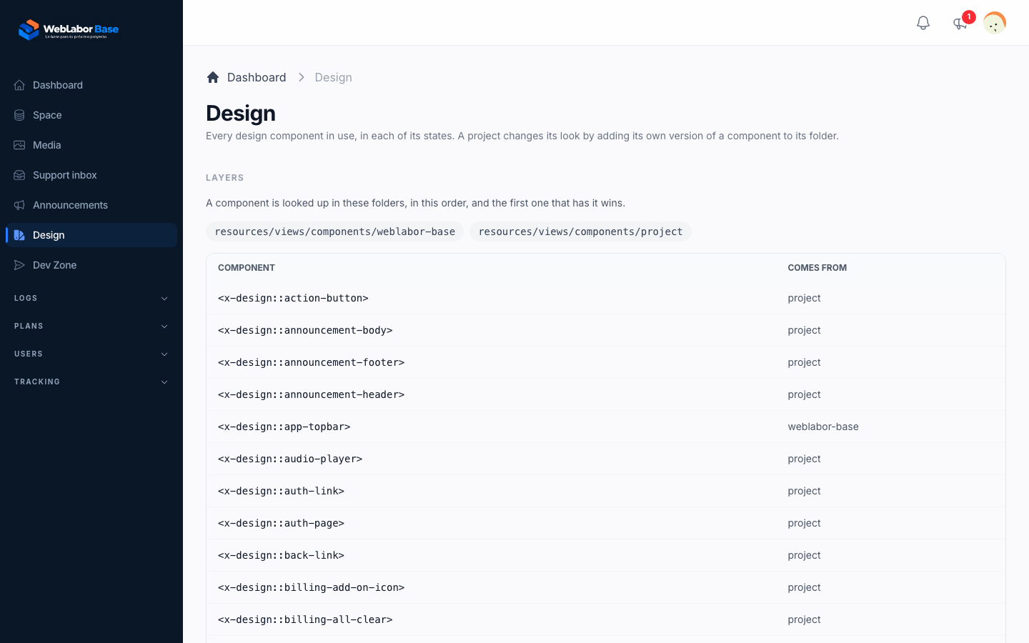
Colours say which shades a screen uses; design components say how it is laid out. The frame of every screen and the pieces screens repeat are Blade components called as <x-design::name>, and they live in resources/views/components/project/:
| Component | What it draws |
|---|---|
auth-page, auth-link |
The sign-in, register, password and verification screens and the page-not-found screen: logo, title, subtitle, the links under it, the card and the footer |
form, submit-button, remember-row, identity-option, notice |
The field stack of a form, its large submit button, "Remember me" beside "Forgot password?", the email, phone or username choice when registering, and a boxed message |
page-header |
The title of a screen, an optional line under it and its actions |
section-header |
The centred heading over a section: a small coloured line, a large title and an optional line under it |
landing-hero, landing-section-title, feature-card, landing-block, landing-cta |
The public landing and feature pages: the large title with its promise, the heading of a landing section, a feature with its icon, an image beside a paragraph with an optional guide link, and the closing call to action |
back-link, help-title, help-card, changelog-day |
The help centre: the way back at the top of a page, the title of a page with the line under it, the card that leads to a guide or a category, and one day of the changelog |
legal-page, legal-section |
The privacy and terms pages: the title with the date of the last update, and one section with its subtitle and its lists |
surface |
The white card a section sits on, padded or not |
option-card |
One way to get something, boxed under its title with its button |
empty-state |
What a list shows when it has nothing, with an icon and an optional action |
usage-card, usage-bar |
How much of an allowance is used: normal, near the limit, over it, and selected |
table, section-label |
A bordered table with its header row, and the small uppercase label above a figure |
app-topbar, user-menu, user-menu-link, menu-divider, page-container |
The top bar, the account menu and the content width of the signed-in area |
topbar-search, drawer-close, breadcrumbs |
The search field of the top bar, the button that closes the sidebar on a phone, and the trail from the section's start to the current screen |
plan-box, sidebar-card |
The box in the sidebar with the plan in use and its upgrade link, and the boxed link that leads to another area |
sidebar-panel, sidebar-brand, sidebar-group-toggle |
The surface the sidebar sits on, the logo or icon at its top, and the heading that folds a group of its links |
dropdown-panel, count-badge, notification-item |
The panel a top-bar button opens, the counter on its corner, and one notification in a list |
stat-card, trend-card |
One figure on its own card, and one with an icon and how much it changed |
tag, status-tag |
A short label on a record, and one that says a state: done, failed, needs attention, in progress |
modal-header, modal-footer |
The title of a modal and the band that holds its buttons |
table-action, field-error, danger-row |
An icon button in a table row, the message under a field, and a row of a danger zone with its button |
folder-tile, progress-bar |
A folder in the media grid, and how far an upload has got |
text-button, resend-code, pin-input |
An action shown as text, the countdown before a new code can be asked for, and the four boxes of a PIN |
public-header, public-footer, help-header |
The top and bottom of the public pages and the top of the help centre |
A project changes any of them by adding a file with the same name to resources/views/components/your-project/: that folder is searched first and project is the fallback, so what you do not redefine keeps the generic look. The chain, and how a product built on another one lists it, is in Make it your own. Keep the attributes and slots of the component you replace, and use the colour tokens inside it, so it still follows a rebrand. A super administrator sees every one of them in use, in each of its states, at /admin/design.
Weblabor Base does exactly this for its own look, the one of its interface manual: its public header and footer and its landing components are redefined in resources/views/components/weblabor-base/, which also holds landing-button, product-preview, icon-strip and icon-strip-item, components only the base has. Your project does not read that folder unless it lists weblabor-base in its chain.
The WireUI components below, the button, the input, the card, the alert and the modal, are not design components: their look comes from the colour tokens and from config/wireui.php.
Fonts and icons
--font-sans reads --brand-font, which the generic resources/css/themes/project.css sets to Inter first, then the system fonts. The generic file does not load Inter, so the browser uses the system font until you add the font yourself, with an @import url(...) or a self-hosted @font-face in your own theme file, as "Your palette and your font" above explains. Weblabor Base's own file loads Inter from Google Fonts in the four weights its manual uses.
Icons come from two sources. Everywhere in the signed-in area and the admin panel, <x-icon name="user" /> draws a Heroicon through WireUI, with variant="solid", mini and class as the usual attributes. The public landing also loads Material Symbols Outlined and draws them as <span class="material-symbols-outlined">bolt</span>.
Form components
Forms are written with components, never raw <input> elements, so every field gets the same label, error message, focus ring and Livewire binding. Two families exist: the WireUI components the kit is built on, and the components the kit adds where WireUI has no answer.
From WireUI
wireui/wireui is installed with no prefix, so its components are called as <x-input>. config/wireui.php holds its defaults: a base shadow, medium rounded corners and primary as the colour. The ones you will use most:
<x-input>
Text and number fields.
Main attributes: label, placeholder, type, hint, icon, prefix, suffix.
<x-input :label="__('Name')" wire:model="name" />
<x-password>
Password with a show/hide toggle.
Main attributes: label, autocomplete.
<x-password :label="__('Password')" wire:model="password" />
<x-select>
Searchable dropdown.
Main attributes: label, options, option-key-value, option-label, option-value, multiselect, clearable.
<x-select
    :label="__('Plan')"
    wire:model="plan"
    :options="$plans"
    option-key-value
/>
<x-native-select>
Plain <select>.
Main attributes: label, options.
<x-native-select :label="__('Size')" :options="['S', 'M']" wire:model="size" />
<x-textarea>
Multi-line text.
Main attributes: label, rows.
<x-textarea :label="__('Notes')" wire:model="notes" />
<x-checkbox>, <x-toggle>, <x-radio>
Booleans and choices.
Main attributes: label, value, left-label.
<x-toggle :label="__('Send me email')" wire:model="send_mail" />
<x-datetime-picker>
Calendar with time.
Main attributes: see <x-date-input> below.
Prefer <x-date-input>.
<x-phone>
Phone number with country mask.
Main attributes: label, placeholder.
Prefer <x-phone-input>.
<x-button>
Buttons and links.
Main attributes: label, primary, positive, negative, flat, outline, icon, href, spinner, full, lg.
<x-button type="submit" primary :label="__('Save')" />
<x-card>
Boxed section with title and footer slot.
Main attributes: title.
<x-card :title="__('Deployment')">...</x-card>
<x-alert>, <x-badge>
Messages and tags.
Main attributes: title, info, positive, negative, warning.
<x-alert :title="__('Saved')" positive />
<x-icon>
Heroicon.
Main attributes: name, variant, mini.
<x-icon name="check-circle" class="h-4 w-4" />
<x-notifications /> and <x-dialog /> are placed once, in the base layout, and receive what a component sends with $this->notification()->success(...) or $this->dialog()->confirm([...]) after use WireUi\Traits\WireUiActions;. Modals open through the wire-elements/modal package with $this->dispatch('openModal', 'component.name', [...]).
From the kit
These live in resources/views/components/, with their PHP class in app/View/Components/ and, where they need state, a Livewire sub-component in app/Livewire/Shared/Inputs/. Each one works with wire:model alone; every other attribute is optional.
<x-date-input>
Date, time or both, stored in UTC and shown in the user's timezone.
Main attributes: label; type (date, time, datetime-local for a native field, omitted for the WireUI calendar); min, max, step; for the calendar also without-time, interval, time-format, clearable, disable-past-dates, parse-format, display-format.
<x-date-input
    :label="__('Birth date')"
    wire:model="user.birth_date"
    type="date"
/>
<x-email-input>
Email with a Verified / Not verified badge and a Verify now link that opens the OTP modal.
Main attributes: label, placeholder.
<x-email-input :label="__('Email')" wire:model.live="email" />
<x-phone-input>
Phone with country mask, the same badge, and the verify link when required.
Main attributes: label, placeholder, validation-required, verified-at, dispatch-context.
<x-phone-input
    :label="__('Phone')"
    wire:model.live="phone"
    :validation-required="true"
    :verified-at="$user->phone_verified_at"
/>
<x-domain-input>
A host name and its TLD in two fields, assembled into one value.
Main attributes: label, name, placeholder; wire:model or value.
<x-domain-input :label="__('Website')" wire:model="website" name="website" />
<x-categories>
One or many categories from the categories table.
Main attributes: type (limits the options to one category type), is-multiple, show-label, initial-value.
<x-categories wire:model="category_ids" type="posts" :is-multiple="true" />
<x-file-uploader>, <x-image-uploader>
Files stored in the media library. The file uploads as soon as it is chosen, with a progress bar and Cancel; the record is related to it only when the form saves. <x-image-uploader> takes images only and shows them as large thumbnails.
Main attributes: model (the record), relation, folder, general, owner, accept, max-size in KB, multiple. The form receives what to do with the files and applies it after saving the record with saveMediaChanges().
<x-image-uploader wire:model="image" :model="$product" folder="Products" />
How the profile picture uses it is in Files, images and storage; every attribute and the Laravel Front inputs are in the media library notes of the developer documentation.
<x-country-select>, <x-division-select>
Country, then state, then city, from the weblabormx/world-ui package.
Main attributes: label, placeholder; id of the parent division on <x-division-select>.
<x-division-select wire:model.live="state" :id="$country" />
<x-audio-player>
Player with waveform, seek bar, speed and volume.
Main attributes: audio (URL; renders nothing when empty), label, compact (play button only, times in a tooltip).
<x-audio-player
    audio="https://your-project.test/voice.mp3"
    :label="__('Voice message')"
/>
The verified inputs dispatch an identity-verified Livewire event when the OTP succeeds; the email input does so under its wire:model column as context, the phone input under dispatch-context when given. The flow, the SMS and email providers and the event payload are in Verify email and phone.
<x-date-input> uses <x-datetime-picker> when type is omitted and a native <x-input type="date"> otherwise. Both read and write the value through the same binding, so the Livewire property receives a string the model's datetime cast turns into UTC. Do not mix in a raw <input type="date">: it is what the component exists to replace.
<x-audio-player.play-button size="md" /> and <x-audio-player.volume-icon /> can be used on their own inside an element that has x-data="audioPlayer(url)".
Layout components
| Component | What it does |
|---|---|
<x-language-switcher /> |
The EN / ES links from config/app.php languages. Renders only for visitors: a signed-in account reads its language from its profile |
<x-design::loading-overlay /> |
The full-screen spinner, placed once in the base layout; see the next section |
<x-design::system-warnings /> |
The warning banner in the signed-in area: it reminds a user without a PIN to set one when the PIN is enabled and, while billing is on, warns of a failed payment, an outstanding balance or an account left without a plan. A warning can carry a line of fine print under its message, with an optional link |
<x-design::sidebar-menu :items :groups /> |
The sidebar of the admin and account areas: items are top-level links (name, url, icon, exact, show, order) and groups collapsible sections filled by the admin resources |
Loading states
A full-screen overlay in <x-design::loading-overlay /> covers the page while something is in flight, driven by resources/js/app.js. It appears on its own during page navigation and during any form submitted with wire:submit. For an action outside a form, add the spinner attribute to the element that fires the request:
<x-button wire:click="confirmMigration" spinner :label="__('Confirm')" />
A file field built with <x-file-uploader> or <x-image-uploader> shows its own progress bar and needs no spinner. Only a hand-written file input does, and there the attribute goes on the <input type="file"> itself, not on the button that opens the picker, because the request starts when the input changes.
Do not add spinner to wire:model.live fields, filters, search boxes or tab switches: those should feel instant and never block the screen. If the overlay stays up for more than three seconds it shows a Reload button, so a screen is never stuck without a way out.
Writing your own input
Before writing one, check the components above. When none fits, keep the same contract: wire:model is the only required attribute and everything else has a default, so a caller never assembles formats, timezones or options by hand. A component with no server-side state is a single Blade file wrapping <x-input {{ $attributes }} />. A component that looks things up or keeps state follows <x-date-input>: a Blade file in resources/views/components/, a class in app/View/Components/ that resolves the current value from the wire:model path, and a Livewire sub-component in app/Livewire/Shared/Inputs/ that renders the field and writes back through the binding. Use the semantic colour tokens inside it and it will follow every rebrand with the rest.